live site:
https://thesaltsuite.com/
CHALLENGE
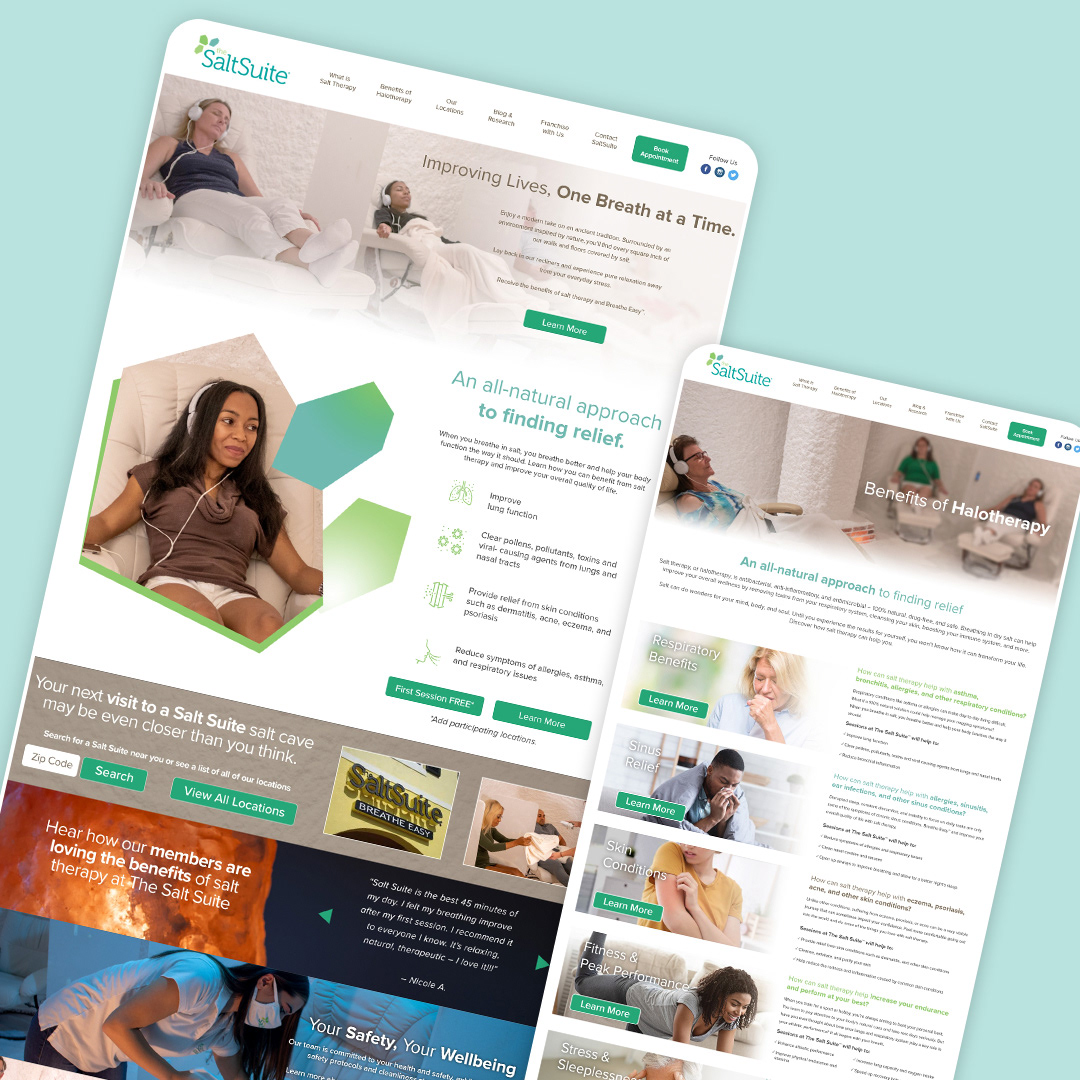
The existing website contained valuable information but presented several usability challenges.
Users were required to navigate through large amounts of content before understanding what salt therapy is, how it works, and what action they should take next. Multiple user types—including first-time visitors, existing customers, and potential franchise owners—were competing for attention within the same experience.
The redesign needed to simplify the user journey without sacrificing the educational content that supports the brand's credibility.
OBJECTIVES
The project focused on four primary goals:
• Improve clarity around the benefits of salt therapy
• Create a cleaner information hierarchy that guides users naturally through the site
• Strengthen calls-to-action for booking appointments and learning more
• Modernize the visual experience while maintaining consistency with the existing brand identity
RESEARCH & DISCOVERY
Before designing new interfaces, I evaluated the existing experience to identify areas that created friction throughout the customer journey.
Key observations included:
• Information overload on primary pages
• Inconsistent visual hierarchy
• Calls-to-action competing for attention
• Long scrolling sections without clear progression
• Navigation that could better support multiple user goals
I also reviewed competitor websites and wellness brands to better understand how similar businesses educate users while building trust.
DESIGN APPROACH
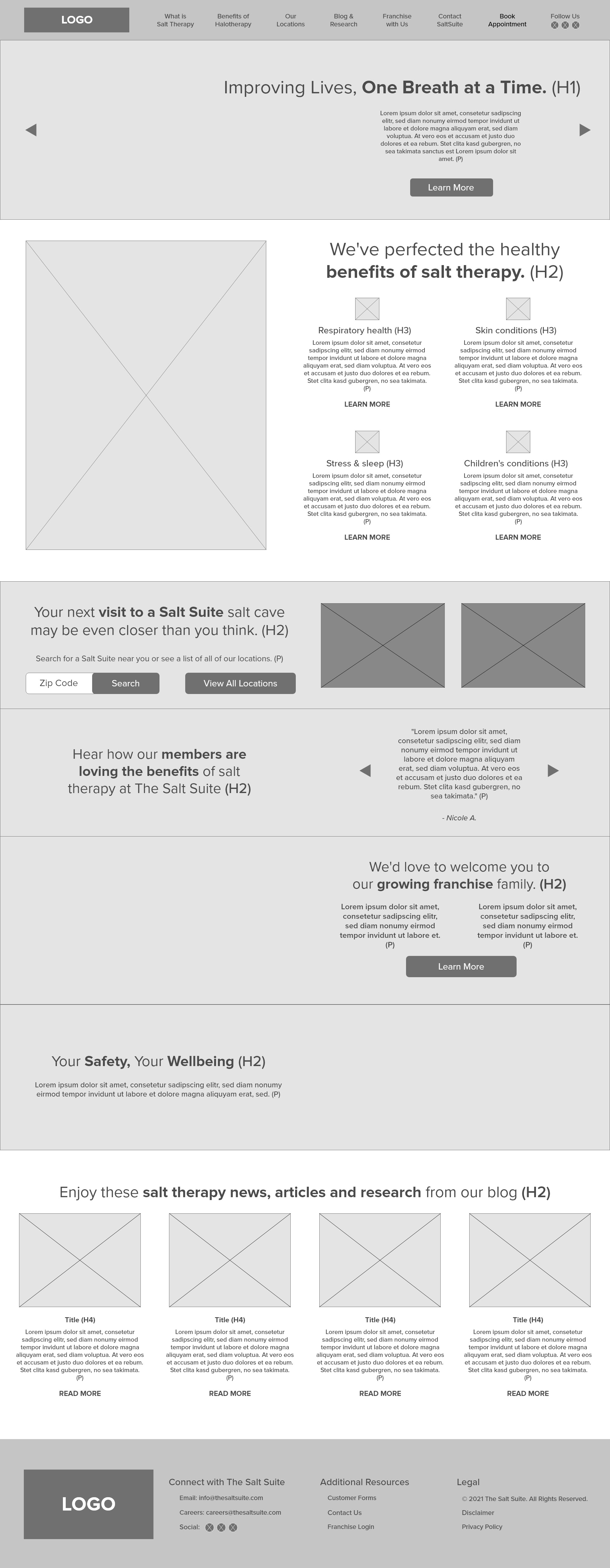
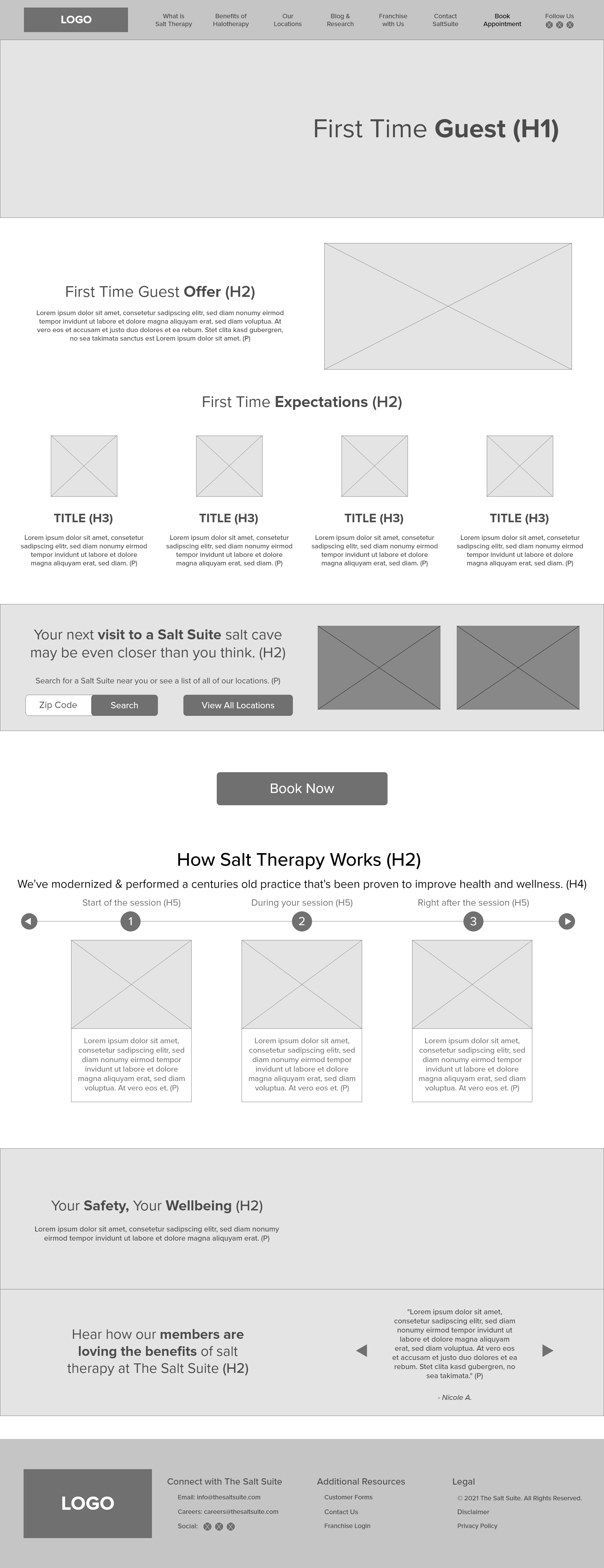
The redesign centered around simplifying complex information into a more approachable experience.
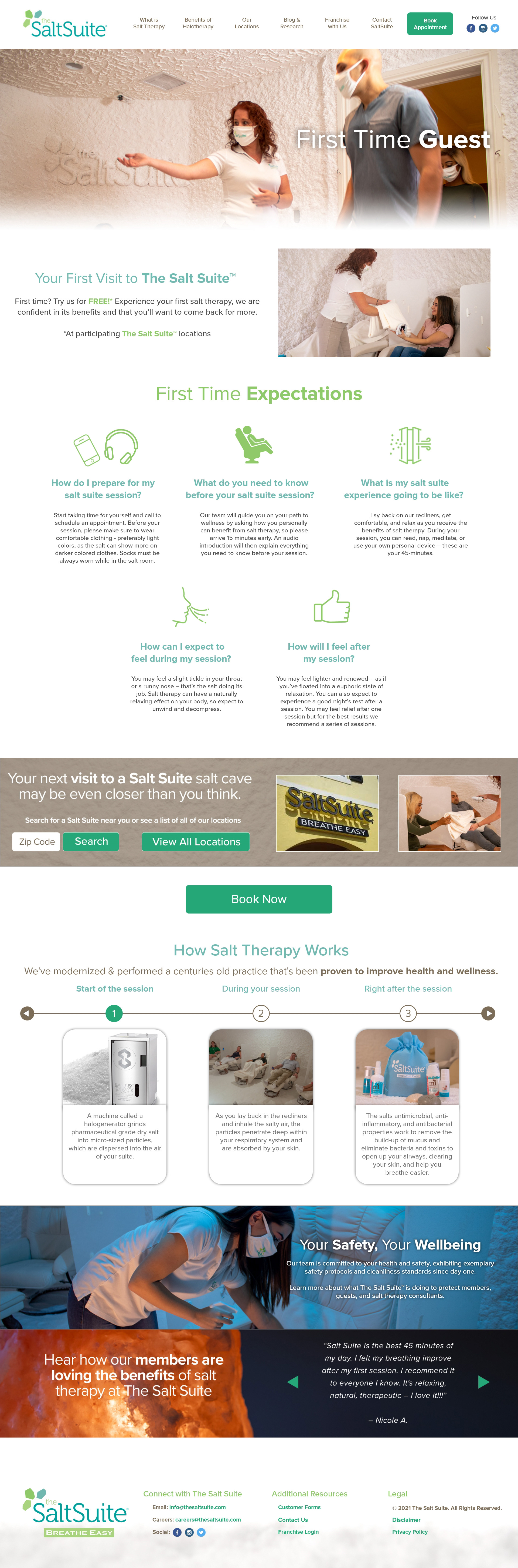
Rather than asking visitors to read large amounts of copy immediately, the new layout uses visual hierarchy, supporting imagery, and modular content sections to gradually educate users while encouraging them to take the next step.
Each section was intentionally designed to answer a common user question:
• What is salt therapy?
• How can it help me?
• Why should I trust this brand?
• Where can I experience it?
• How do I get started?
VISUAL DESIGN
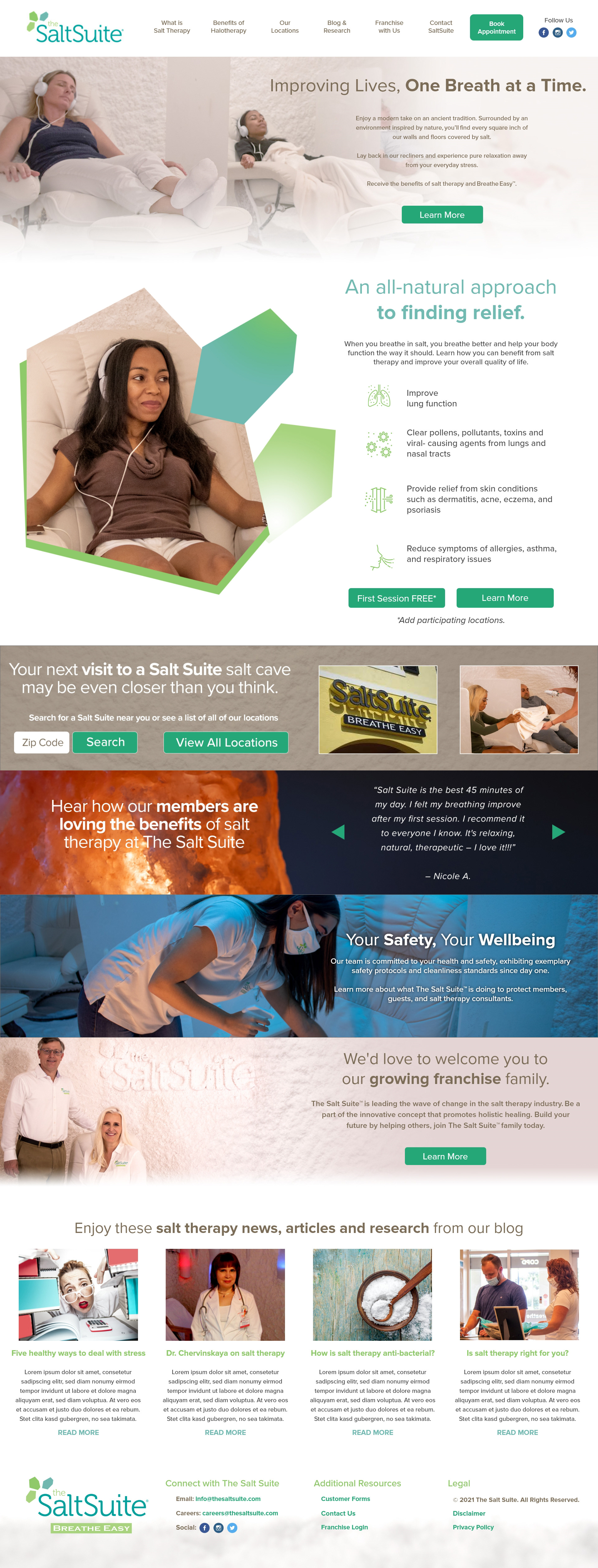
The visual direction was inspired by the calming atmosphere customers experience inside a
Salt Suite location.
Salt Suite location.
Soft color palettes, generous spacing, natural textures, and refined typography work together to create an interface that feels approachable, trustworthy, and relaxing.
Rather than relying on decorative elements, the design emphasizes clarity and simplicity to support both usability and the brand's premium positioning.
IMPACT & RESULTS
The redesign transformed the website into a more focused and intuitive digital experience that better communicates The Salt Suite's mission while guiding visitors toward meaningful actions.
By improving navigation, simplifying content organization, and strengthening the visual hierarchy, the new experience helps users understand the value of salt therapy with greater confidence and less effort.